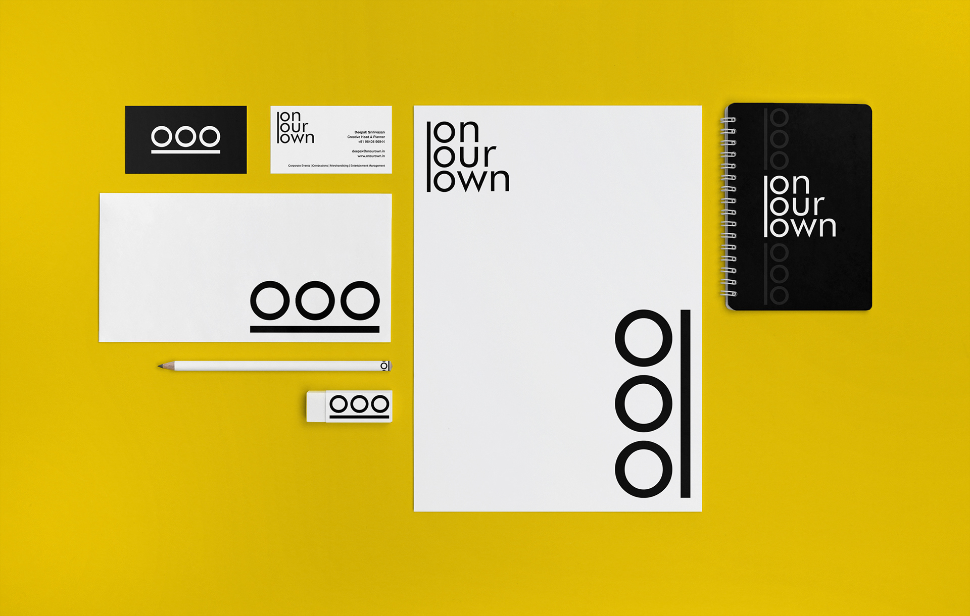
On Our Own is an Event Management company with a difference. The brief was to create a brand identity that would be simple and adaptable across mediums, with a scope for motion graphics, as the brand would be dealing with a lot of videos.
The monocolour logoform can be used in combination with any colour.

The Logo Form

The one thing that really caught the attention was the repetition of the letter 'O'. This was used to create a wordmark and a symbol mark, which lent to the adaptability.