dFrost is the annual design and cultural festival hosted by the National Institute of Design, R&D Campus, Bangalore. Its aim is to move away from a conventional college festival to create a platform where innovators from different fields engage in thought-provoking conversations that bring multiple disciplines together.
The branding of this project was undertaken in a team, which worked in tandem with the website and installation teams.
(With Akshay Khurana, Ankita Mitra, Santhoshram Ekambaram Narayanan and Suraj Barthy.)
Concept
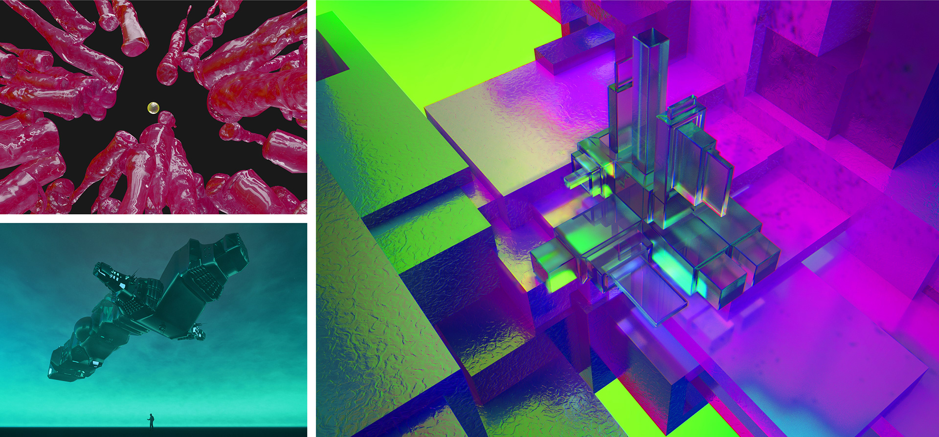
Our main source of inspiration came from the artwork of Suraj Barthy, a student of the National Institute of Design.
The campus became a vortex - a whirlpool pulling in people, ideas, events and performances with all their vibrant energy and colours. The concept was to enrich the otherwise mundane reality we experience, making it surreal and otherworldly. This new, unexplored territory set the stage for evolution, trails to be blazed, and a development of new perspectives.
Visual Identity
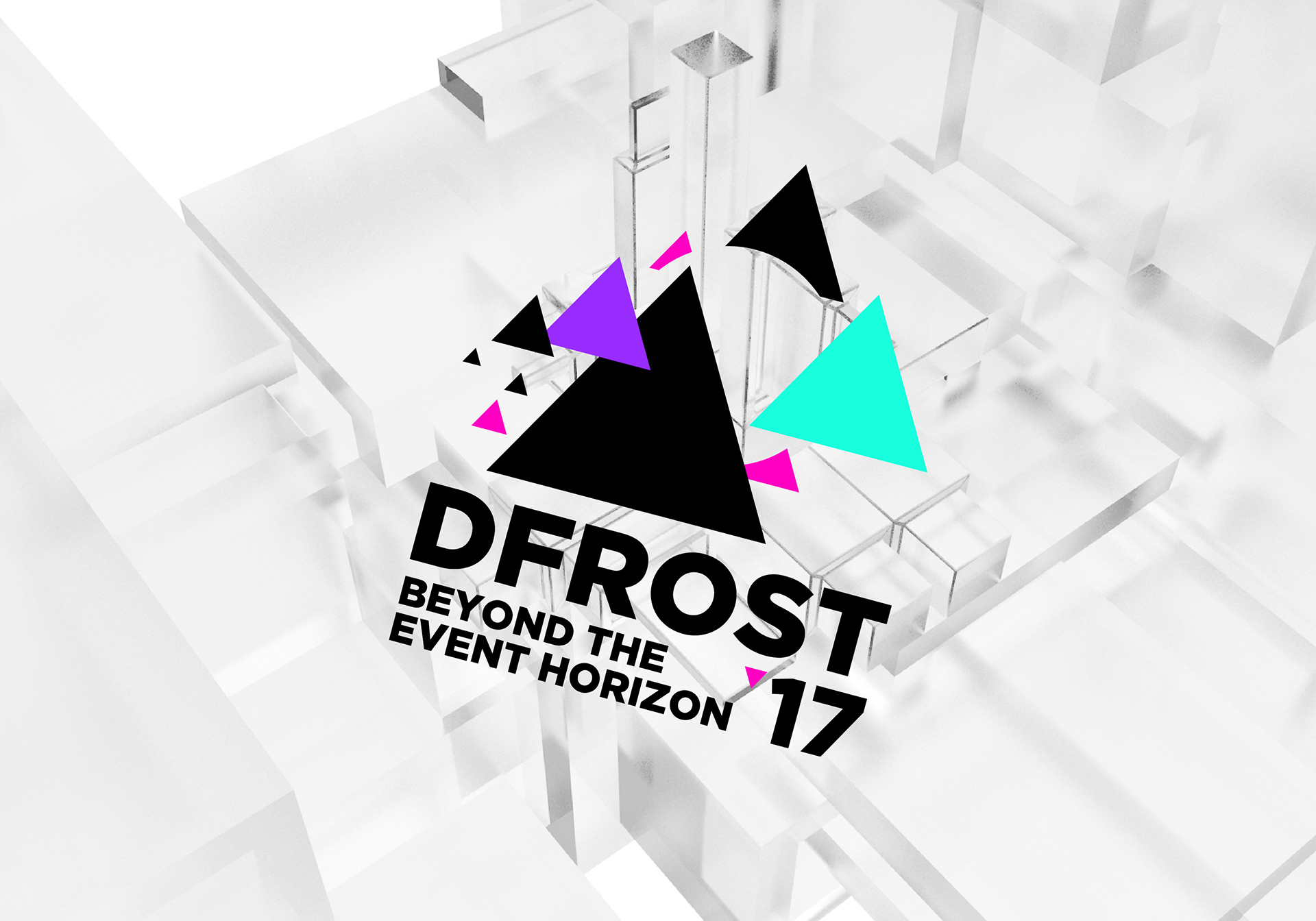
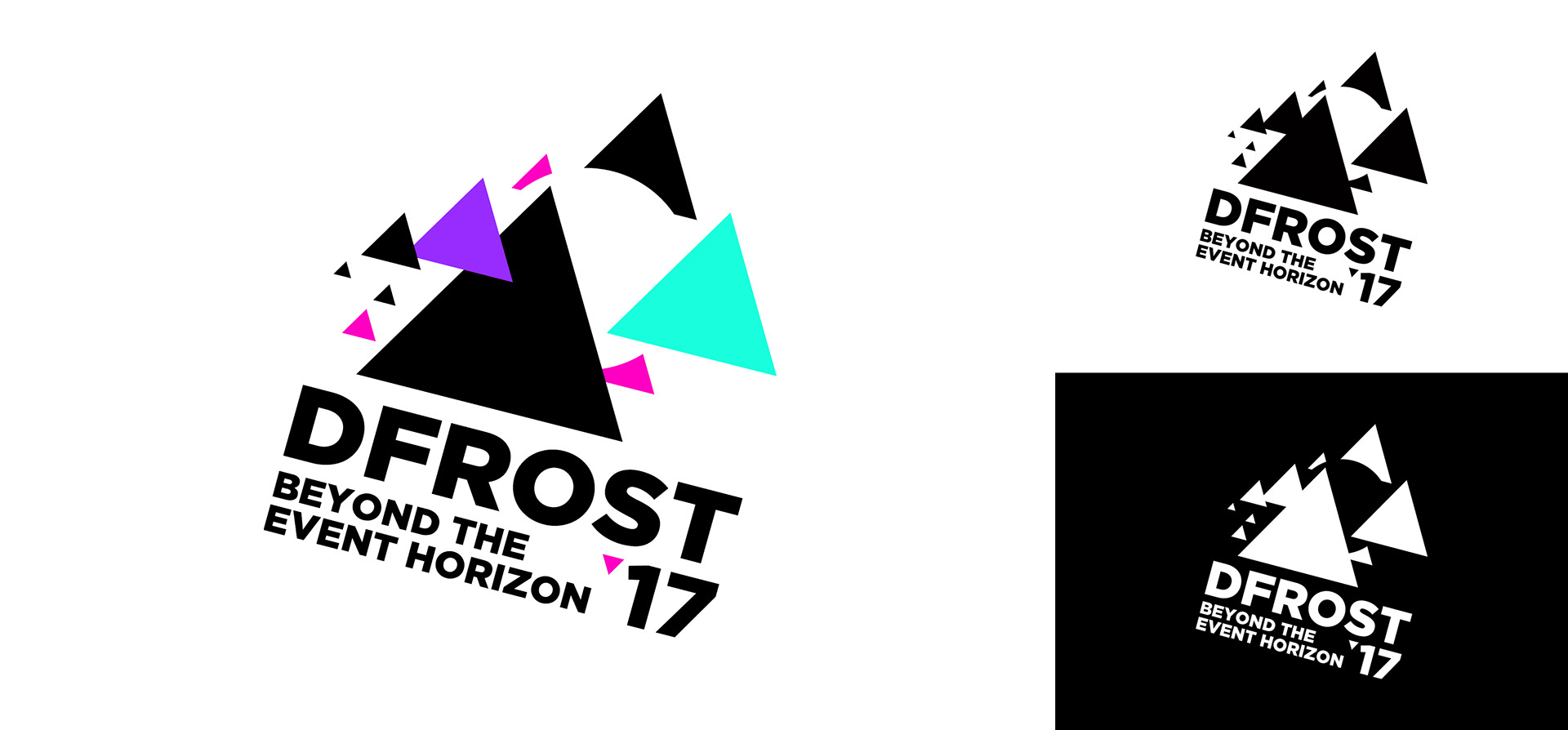
The tagline for dFrost ’17 was finalised as ‘Beyond The Event Horizon’.
Keeping the theme in mind, the logo had to be dynamic and engaging. With the play of positive and negative space, and the use of neon colours, the volatile looking logo became the foundation for the visual language of the festival.
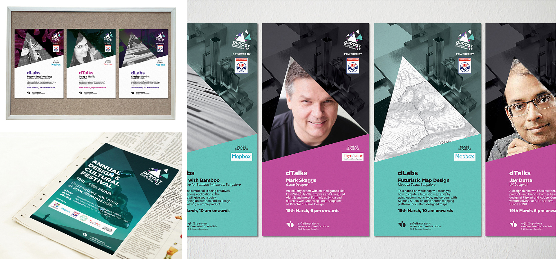
Print Media
Print media included posters across university campuses in Bangalore, a newspaper advertisement featured in The Hindu newspaper, and banners that aided wayfinding on campus.
The posters for dTalks (speeches by people from the field of design) and dLabs (workshops by experienced professionals) followed the triangular, slightly off-kilter language of the brand.
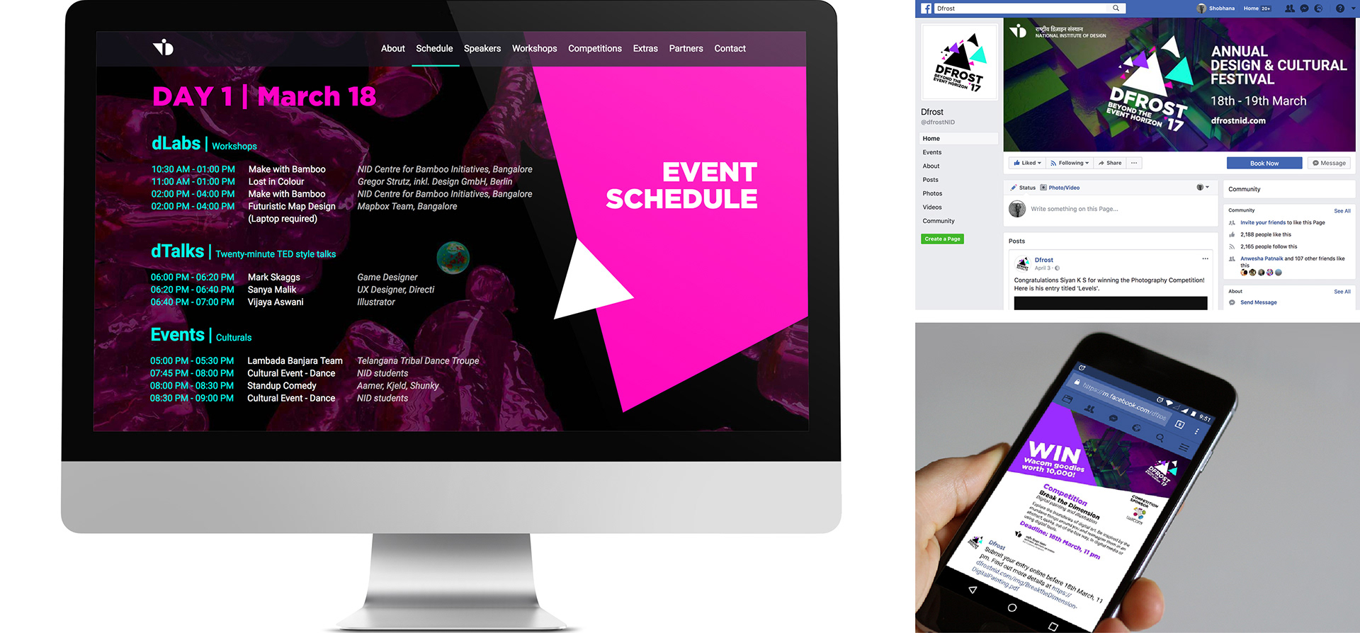
Digital Media
The layout for the website was kept simple, with all the information on one page, in a few scrolls. The website, too, took motifs from the logo to aid in its rhythmic user interface.
Social media posts across Facebook, Instagram and YouTube ensured a similar link to maintain the brand of dFrost '17.
Every touch point for the event was made dynamic, keeping in mind the atmosphere that we wanted to create when the day arrived.
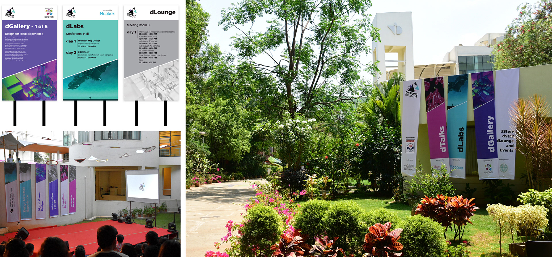
Wayfinding
The banners and signage were colour coded for ease in wayfinding around campus. Each colour was taken from the logo of the event. Pink for dTalks, teal for dLabs, purple for dGallery, and white for dLounge.
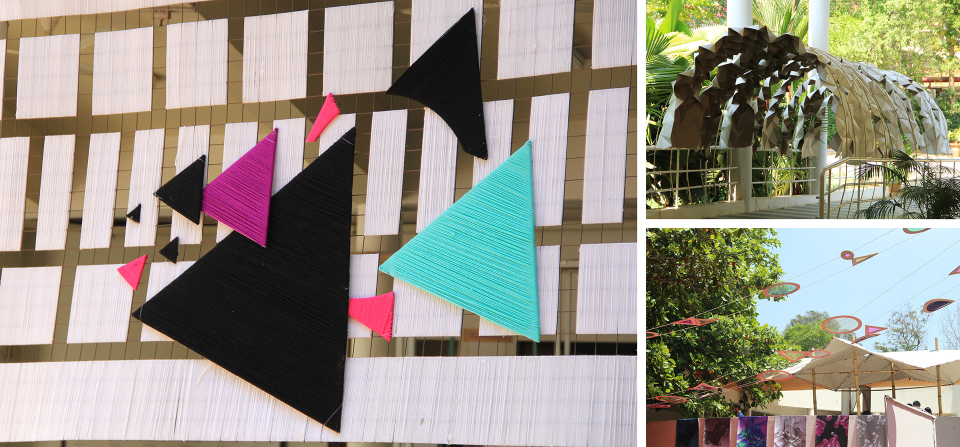
Installations
The visual language also dictated the appearance of installations across event spaces, like a yarn bombed backdrop, an archway at the entrance, and a canopy over the performance area.
Together, the dFrost '17 environment was created.